
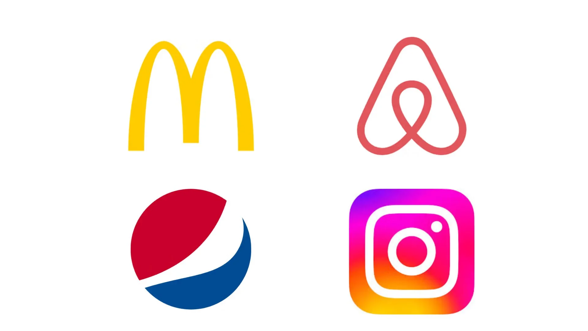
Geometric Branding: The Science Behind Logo Shapes
When people think about logos, they often focus on color, typography, or style trends. But there is another element working quietly — and powerfully — beneath the surface: shape.
Geometric branding isn’t just an aesthetic choice. Shapes influence perception, emotion, and trust at a subconscious level. Long before a viewer reads your brand name or understands your message, their brain is already reacting to the geometry of your logo.
This article explores the science behind geometric shapes in branding, why they matter, and how to use them intentionally to build a stronger, more memorable brand identity.
Why Shapes Matter More Than You Think
The human brain is wired to recognize shapes faster than words. From an evolutionary perspective, shapes helped us identify threats, safety, and patterns long before language existed. This instinct still applies today — especially in branding.
Research in cognitive psychology shows that people form emotional judgments about visuals in less than one second. Shapes act as shortcuts, communicating meaning instantly without explanation.
In branding, this means:
Shapes set emotional expectations
Shapes influence perceived personality
Shapes affect trust and memorability
A logo’s shape is often the first message your brand sends, whether you intend it or not.
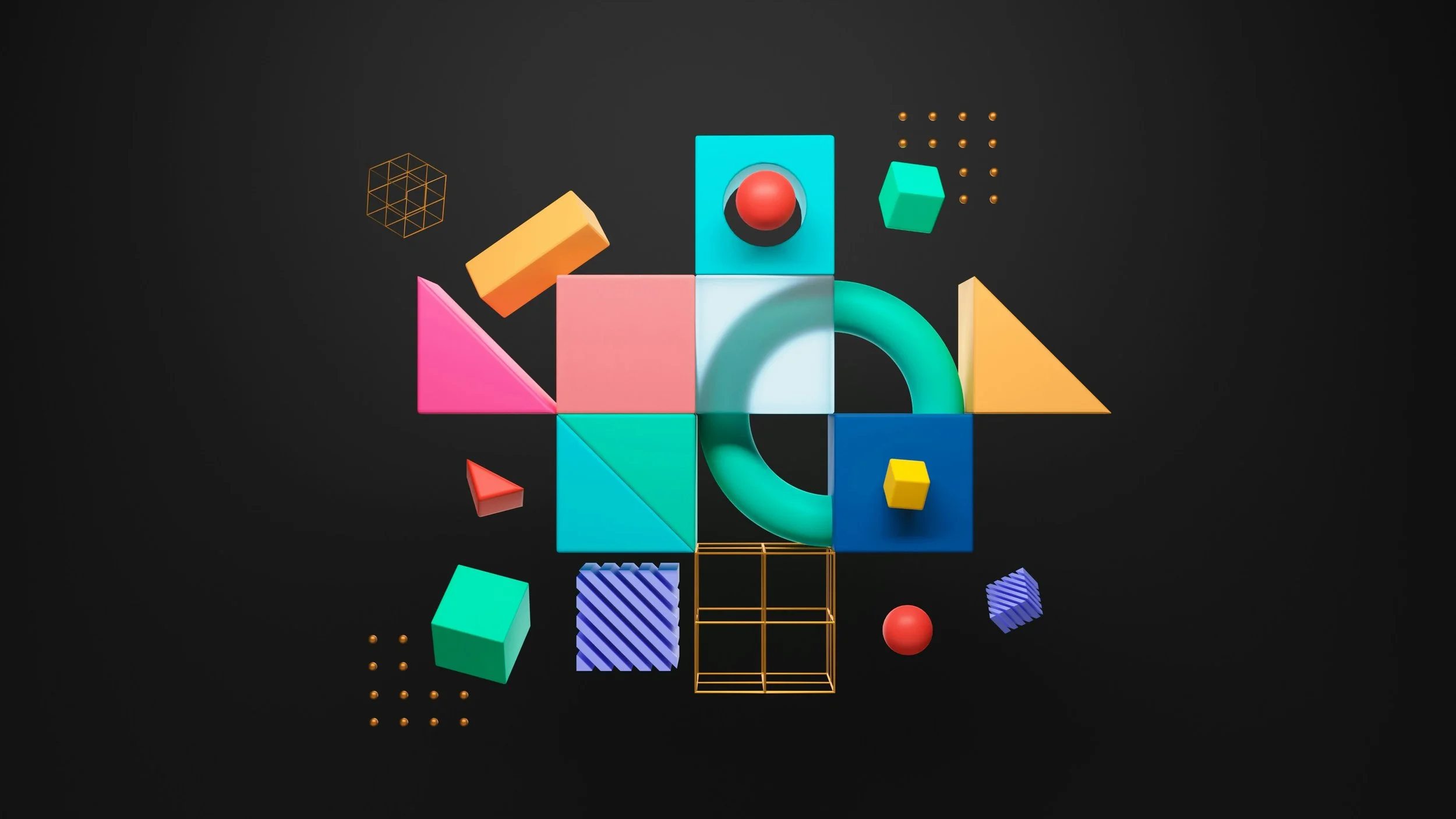
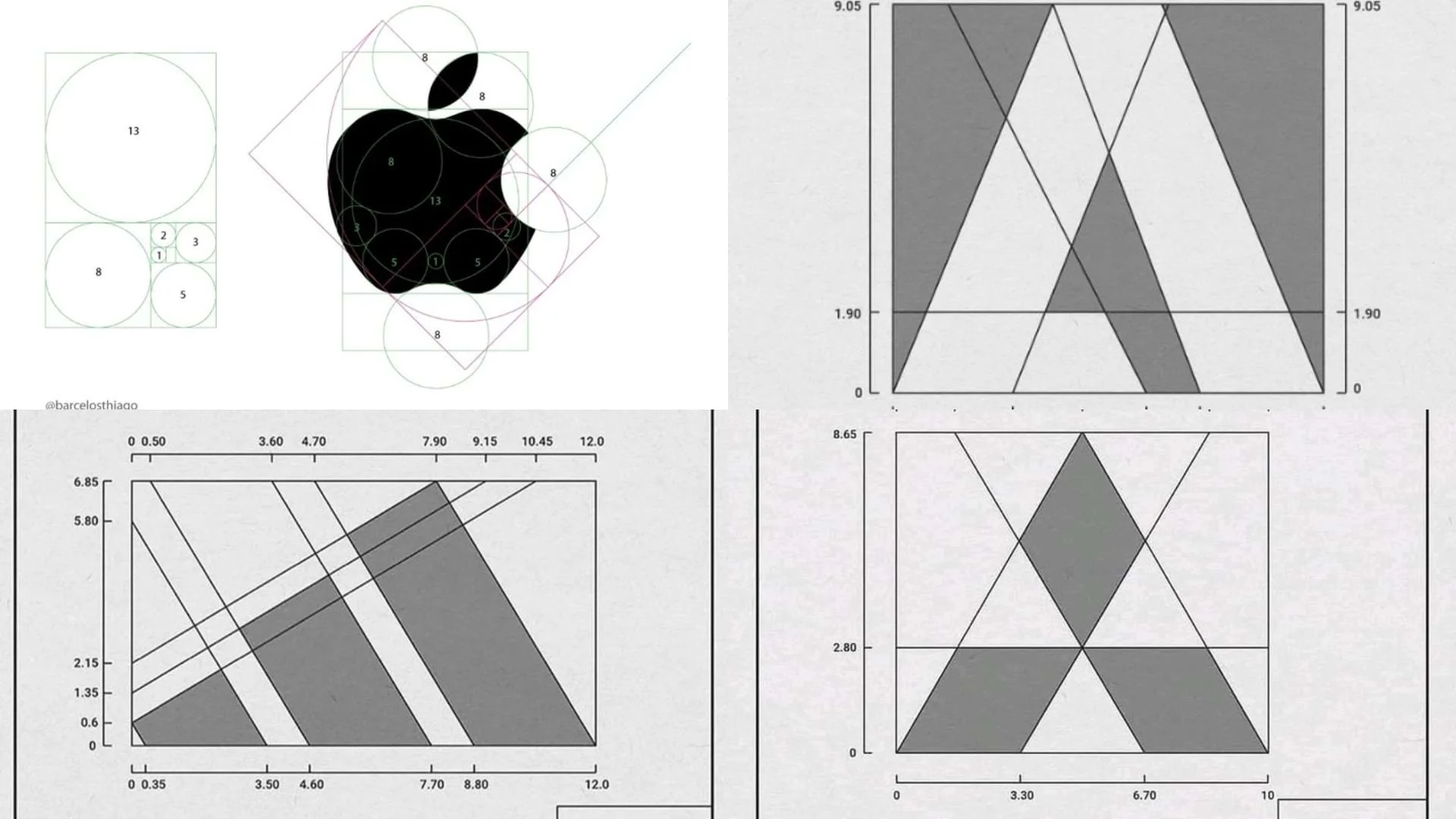
The Psychology of Core Geometric Shapes
Circles: Unity, Trust, and Humanity
Circles are soft, continuous, and inclusive. With no beginning or end, they symbolize wholeness, harmony, and connection.
Psychological associations:
Community and belonging
Friendliness and warmth
Protection and continuity
Brands that use circular logos often want to feel approachable, human, and emotionally safe. Circles reduce tension and feel less aggressive than angular shapes.
Best for brands that value:
Relationships and community
Wellness, lifestyle, or care
Technology with a human touch
However, circles can also feel less authoritative if overused or poorly balanced. They need structure to avoid appearing vague or weak.
Squares and Rectangles: Stability, Structure, and Reliability
Squares and rectangles are rooted in order. They reflect balance, logic, and predictability — qualities that signal trust and professionalism.
Psychological associations:
Strength and dependability
Security and control
Tradition and authority
These shapes are common in finance, architecture, and corporate branding because they feel solid and dependable.
Best for brands that value:
Professionalism and credibility
Systems, frameworks, and logic
Long-term reliability
The risk? Overuse can make a brand feel rigid, conservative, or emotionally distant. Many modern brands soften squares with rounded corners to combine trust with approachability.
Triangles: Direction, Energy, and Ambition
Triangles are dynamic and directional. Unlike circles and squares, they imply movement — upward, forward, or outward.
Psychological associations:
Progress and action
Power and innovation
Tension and ambition
Triangles naturally draw the eye and suggest momentum. When pointed upward, they often symbolize growth and leadership. When inverted, they can feel unstable or rebellious.
Best for brands that value:
Innovation and disruption
Performance and speed
Bold positioning
Triangles demand careful handling. Sharp angles can feel aggressive or unsafe if not balanced with spacing, color, or typography.
Circles: Unity, Trust, and Emotional Connection
Circles are soft, continuous, and inclusive. Unlike squares and triangles, they have no sharp edges or visual hierarchy, creating a sense of wholeness and ease.
Psychological associations:
Trust and safety
Warmth and approachability
Unity and belonging
Circles feel human and reassuring. Their endless form suggests continuity and connection, making them especially effective at reducing psychological distance between a brand and its audience.
Best for brands that value:
Community and relationships
Wellness, care, and lifestyle
Human-centered technology
Circles require structure to avoid feeling generic or passive. When paired with strong typography or clear systems, they balance emotional warmth with credibility and intent.
Lines and Minimal Geometry: Precision and Modernity
Simple lines and stripped-down geometry communicate clarity and focus. They suggest efficiency, intelligence, and modern thinking.
Psychological associations:
Precision and discipline
Minimalism and confidence
Technological sophistication
Brands using minimal geometric forms often rely on proportion and spacing rather than decoration. This approach signals confidence — nothing extra, nothing to hide.
Best for brands that value:
Modern aesthetics
High-end or tech-forward positioning
Design-led identities
Minimalism amplifies mistakes. When geometry is simple, proportions must be perfect — otherwise the logo feels unfinished or generic.
How Geometry Shapes Brand Personality
Think of geometry as body language for your brand.
Rounded shapes feel friendly and conversational
Angular shapes feel assertive and decisive
Symmetry feels calm and trustworthy
Asymmetry feels creative and expressive
These cues work together to shape how people describe your brand — even if they’ve never interacted with it before.
This is why two logos with the same color and typography can feel completely different based on shape alone.
The Role of Balance and Proportion
Shape psychology doesn’t work in isolation. Balance, spacing, and proportion determine whether a geometric logo feels refined or chaotic.
Well-balanced geometry:
Reduces cognitive strain
Feels intentional and premium
Improves memorability
Poor balance, even with “correct” shapes, creates discomfort. The brain notices when something feels off — even if the viewer can’t explain why.
Good geometric branding is less about the shape itself and more about how carefully it’s constructed.
Trends vs. Timeless Geometry
Geometric branding has surged in popularity because of its scalability and digital adaptability. Simple shapes work better across screens, apps, and motion systems.
But there’s a trap:
When brands follow geometric trends without strategy, logos become interchangeable.
Timeless geometric branding:
Is rooted in brand meaning, not trends
Uses shape as a metaphor, not decoration
Prioritizes clarity over cleverness
A strong geometric logo still makes sense 10 years later, even as visual styles evolve.
Choosing the Right Shape for Your Brand
Before choosing a shape, ask:
What should people feel first?
Do we want to appear human or authoritative?
Stable or dynamic? Calm or bold?
There is no “best” shape — only the shape that aligns with your brand’s values, voice, and long-term vision.
When geometry supports strategy, branding becomes intuitive. When it doesn’t, even the most beautiful logo struggles to connect.
Final Thoughts
Geometric branding is not just about clean design or modern aesthetics. It’s about understanding how humans perceive meaning through form.
Shapes speak — quietly, instantly, and emotionally.
When chosen with intention, geometry becomes one of the most powerful tools in brand identity. Not because it looks good, but because it feels right.
And in branding, feeling right is often what makes people stay.