
Color Psychology in Branding
In a world overflowing with brands, messages, and visual noise, people don’t choose brands logically first — they feel them first. And before a word is read or a product is tested, color has already spoken.
Color psychology in branding is not about picking what looks nice. It’s about understanding how color influences perception, emotion, memory, and behavior — and using that understanding to differentiate your brand in a crowded marketplace.
When used strategically, color becomes more than decoration. It becomes positioning.

Why Color Matters More Than You Think
Research consistently shows that people form an impression of a brand within seconds, and color plays a dominant role in that judgment. Color helps consumers:
Recognize your brand faster
Associate emotions and values with your business
Decide whether your brand feels trustworthy, premium, playful, bold, or calm
In fact, strong color consistency can increase brand recognition significantly. This is why many successful brands fiercely protect their color systems — because color becomes shorthand for identity.
But here’s the catch: popular colors are popular for a reason — and that’s exactly why they’re risky.

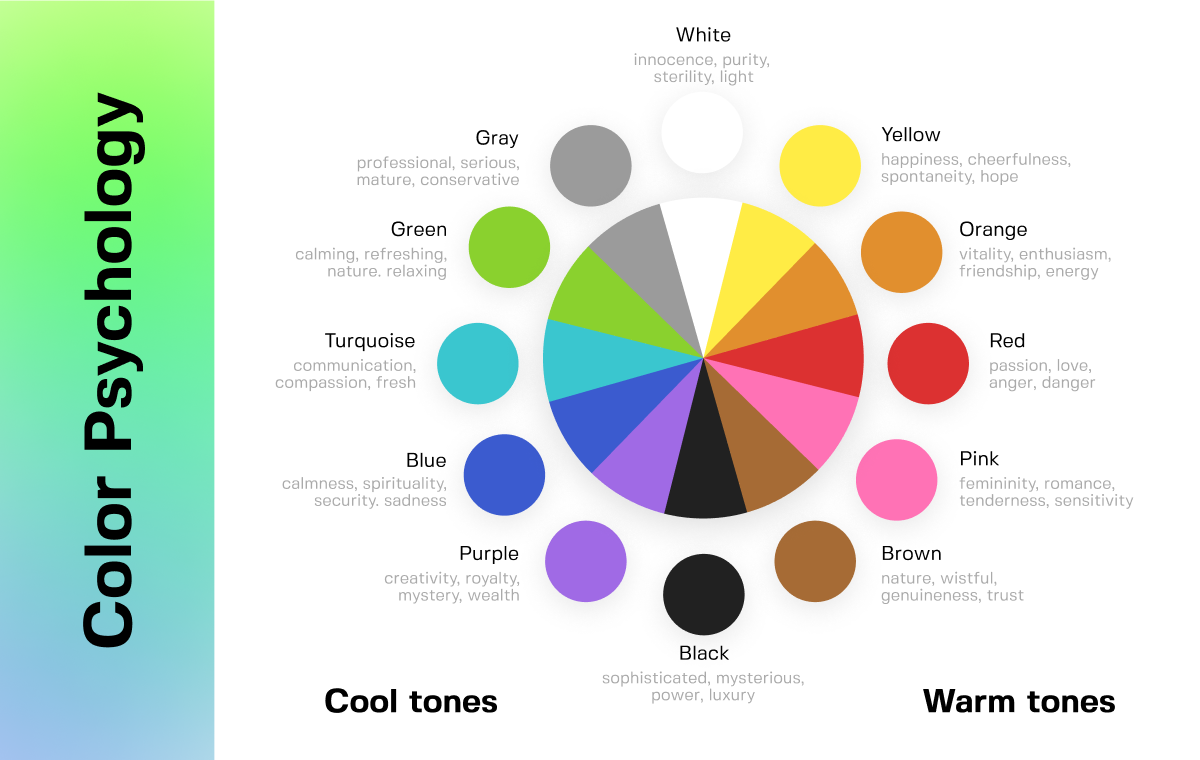
The Emotional Language of Color (Quick Overview)
While color meanings can vary by culture and context, some emotional associations tend to be widely understood:
Red: Energy, urgency, passion, appetite
Blue: Trust, stability, professionalism, calm
Yellow: Optimism, warmth, attention
Green: Growth, nature, balance, wellness
Purple: Creativity, luxury, imagination
Black: Sophistication, power, authority
White: Simplicity, clarity, purity
Understanding these associations is only the starting point. The real branding work begins when you ask a more important question:
What does this color say about me in my category?
The Biggest Mistake Brands Make with Color
Many brands choose colors by following trends or copying competitors.
Tech startups default to blue. Wellness brands lean into green. Luxury brands go black. And suddenly, everyone looks… the same.
When brands blend in visually, they’re forced to compete on price, features, or louder messaging — all of which are expensive and unsustainable.
Standing out doesn’t always mean choosing a “loud” color. It means choosing a meaningful one.
How to Use Color to Differentiate Your Brand
1. Map the Competitive Landscape
Before choosing a color palette, study your competitors. Lay out their brand colors side by side.
Ask yourself:
Which colors dominate the category?
Which emotions are overused?
Where is there visual sameness?
Your goal isn’t to be different for the sake of difference — it’s to own a distinct emotional space.
Sometimes differentiation comes from contrast. Other times, it comes from subtle deviation: a warmer blue, a muted red, a softer black.
2. Start with Brand Personality, Not Preference
Color should express who your brand is, not what you personally like.
Define your brand personality clearly:
Is it calm or energetic?
Bold or refined?
Playful or serious?
Human or authoritative?
A confident, minimalist brand may use restrained tones with high contrast. A friendly, community-driven brand may benefit from warmer, softer hues.
When color aligns with personality, consistency becomes effortless — because every visual decision has a clear filter.
3. Use Color Systems, Not Single Colors
Strong brands don’t rely on one color. They build color systems.
This includes:
A primary color that anchors recognition
Supporting colors for flexibility
Neutral tones for balance
Accent colors for emphasis and hierarchy
A thoughtful system allows your brand to adapt across platforms while staying recognizable. It also prevents visual fatigue and keeps your identity from feeling flat or repetitive.
4. Think in Context, Not Isolation
A color never exists alone. It interacts with typography, layout, imagery, and whitespace.
The same color can feel:
Premium or cheap
Modern or outdated
Calm or aggressive
…depending on how it’s used.
Always test colors in real brand applications: websites, packaging, social media, ads. Context reveals truth faster than mood boards.
5. Consistency Builds Trust — Variation Builds Interest
Consistency creates familiarity. Familiarity builds trust.
But consistency doesn’t mean rigidity.
The most memorable brands know how to stay consistent while evolving. They use variation in tone, texture, and composition — without abandoning their core palette.
This balance keeps the brand recognizable yet alive.

Color Is Strategy, Not Decoration
When chosen thoughtfully, color becomes a strategic asset. It helps customers remember you, feel something about you, and choose you — often without knowing why.
The brands that stand out aren’t always the loudest or most colorful. They’re the ones whose colors feel inevitable — as if no other choice would make sense.
So before asking, “What color should my brand be?”, ask instead:
“What do I want people to feel — and how do I want to be remembered?”
Color will answer — if you listen carefully.